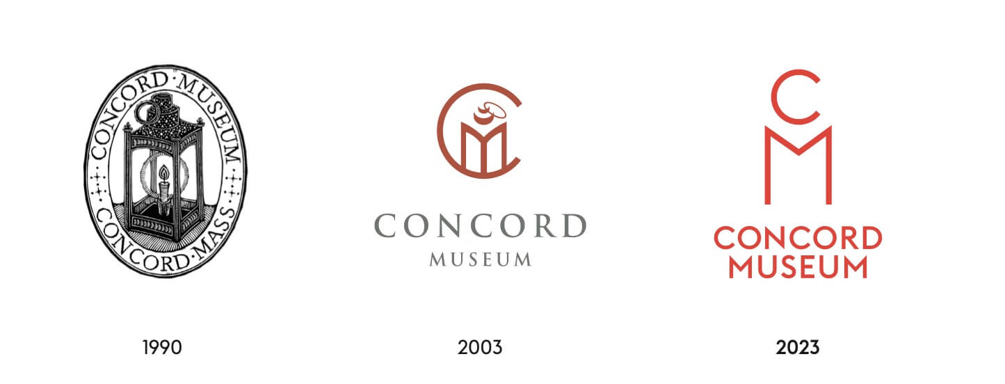
The 1990 logo for the Concord Museum reflected its most famous artifact: the single “one if by land” lantern hung from Boston’s Old North Church to direct Paul Revere’s April 18, 1775, journey. A revamp, in 2003, featured a more stylized image.
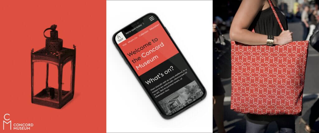
At a quick glance, the branding rolling out this fall reduces the logo to a simple scarlet C and M. As with any artwork, a closer look is in the detail: the smaller C curving atop the M creates a simple outline of a lit lantern.
The new look reflects the museum’s decade-long modernization, which includes a state-of-the-art Education Center, 16 new galleries, and an expansive collections storage space.
The project was completed in collaboration with Fran Gormley of Greenwich Marketing Group, whose clients include the Metropolitan Museum of Art, Bausch & Lomb, and JP Morgan Chase.
Concord Museum Executive Director Lisa Krassner noted that while the museum itself looks at Concord’s history, the overall goal is to “reflect who we are today — welcoming, inclusive, and engaging.”
That will extend to the museum’s website, with a more readable typeface and a stark palette of red, black, and white. It’s now optimized to be easily read on a cell phone — a must for tourists trying to take in all of Concord’s history.


